


Letterpress Showcase
~Introducing works created by our customers~
Click on the image to see details such as the materials used.
Awaikoko's work
Tap the image to see details

箔押し 印刷機:ダイカットマシン「ワンダーカッツ」 紙:色画用紙

箔押し ダイカットマシン「ワンダーカッツ」 紙:色画用紙

箔押し ダイカットマシン「ワンダーカッツ」 紙:色画用紙
箔押し 印刷機:ダイカットマシン「ワンダーカッツ」 紙:色画用紙
Foil stamping

💬Comments
I really wanted to put a title in foil using letterpress printing on the cover of my handmade zine.
Works by Tomomatsuyuki
画像タップで詳細表示

紙:アラベール 200kg

紙:アラベール 200kg
紙:アラベール 200kg
💬Comments
Since it was my first time printing at home, I used a variety of papers. I thought I could use thick paper to create the uneven texture that is unique to letterpress printing, but I learned that drawing paper, which can also be used for illustrations, is more likely to be indented than I expected, which is a learning experience.
Printing in large quantities is surprisingly tidy, so it's probably best to order it, but it was perfect for trying out variations or making small batches. In the future, I'd like to try two- and three-color printing.
Letterpress Atelier Fujino's work
Tap the image to see details


印刷機:テキン 紙:コースター厚さ1ミリ
💬Comments
Letterpress inks are mixed with base colors such as ultramarine, crimson, grass, fluorescent pink, and white.
Depending on the type of plate, the type of paper, and its thickness, the relief blemishes, the depth of the debossing, and the sharpness of the lines vary, which is a fresh surprise every time. I enjoy printing while matching each plate to the different expressions.
Letterpress Atelier Fujino's work
Tap the image to see details

印刷機:シジックスビッグショット フォルダウェイ 紙:ハーフエア180kg コルク インキ:金赤

印刷機:シジックスビッグショット フォルダウェイ 紙:ハーフエア180kg コルク インキ:金赤
印刷機:シジックスビッグショット フォルダウェイ 紙:ハーフエア180kg コルク インキ:金赤
💬Comments
Letterpress inks are mixed with base colors such as ultramarine, crimson, grass, fluorescent pink, and white.
Depending on the type of plate, the type of paper, and its thickness, the relief blemishes, the depth of the debossing, and the sharpness of the lines vary, which is a fresh surprise every time. I enjoy printing while matching each plate to the different expressions.
Works by Kiyomi Gonda
Tap the image to see details

印刷機:ダイカットマシン「ワンダーカッツ」 紙:カラープラン-FS

印刷機:ダイカットマシン「スペルバインダーズプラチナム」

印刷機:ダイカットマシン「ワンダーカッツ」 紙:カラープラン-FS
印刷機:ダイカットマシン「ワンダーカッツ」 紙:カラープラン-FS
Printing in the Shin-eisha workspace

💬Comments
I had always wanted to print the illustrations I drew using letterpress printing, and thanks to my connection with Shin-eisha, I was able to make this dream come true.
Because they are made by hand, the strength of the lines varies from piece to piece, and I really liked that subtle feel.
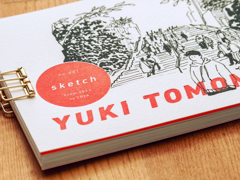
Works by Tomomatsuyuki
Works by Tomomatsuyuki
画像タップで詳細表示

紙:ハー�フエアコットン インキ:黒、群青、高彩度レッド、蛍光グリーン

紙:ハーフエアコットン インキ:黒、群青、高彩度レッド、蛍光グリーン

紙:ハーフエアコットン インキ:黒、群青、高彩度レッド、蛍光グリーン
紙:ハーフエアコットン インキ:黒、群青、高彩度レッド、蛍光グリーン
💬Comments
Since it was my first time printing at home, I used a variety of papers. I thought I could use thick paper to create the uneven texture that is unique to letterpress printing, but I learned that drawing paper, which can also be used for illustrations, is more likely to be indented than I expected, which is a learning experience.
Printing in large quantities is surprisingly tidy, so it's probably best to order it, but it was perfect for trying out variations or making small batches. In the future, I'd like to try two- and three-color printing.
Works by Tomomatsuyuki
画像タップで詳細表示

印刷機:箔押し機 紙:紙コースター インキ:金箔

印刷機:箔押し機 紙:紙コースター インキ:金箔

印刷機:箔押し機 紙:紙コースター インキ:金箔
印刷機:箔押し機 紙:紙コ�ースター インキ:金箔
💬Comments
Since it was my first time printing at home, I used a variety of papers. I thought I could use thick paper to create the uneven texture that is unique to letterpress printing, but I learned that drawing paper, which can also be used for illustrations, is more likely to be indented than I expected, which is a learning experience.
Printing in large quantities is surprisingly tidy, so it's probably best to order it, but it was perfect for trying out variations or making small batches. In the future, I'd like to try two- and three-color printing.
Works by Tomomatsuyuki
Works by Tomomatsuyuki
画像タップで詳細表示

紙:アルデバラン(250g) インキ:蛍光レッド(活版インキ)
紙:アルデバラン(250g) インキ:蛍光レッド(活版インキ)

紙:ハーフエアヘンプ インキ:ブラック(サクラ版画用絵具)
紙:アルデバラン(250g) インキ:蛍光レッド(活版インキ)
💬Comments
Since it was my first time printing at home, I used a variety of papers. I thought I could use thick paper to create the uneven texture that is unique to letterpress printing, but I learned that drawing paper, which can also be used for illustrations, is more likely to be indented than I expected, which is a learning experience.
Printing in large quantities is surprisingly tidy, so it's probably best to order it, but it was perfect for trying out variations or making small batches. In the future, I'd like to try two- and three-color printing.
Works by Tomomatsuyuki
画像タップで詳細表示

印刷機:ワンダーカッツ 紙:山櫻ハーフエアヘンプ インキ:墨

印刷機:ワンダーカッツ 紙:山櫻ハーフエアヘンプ インキ:墨

印刷機:ワンダーカッツ 紙:山櫻ハーフエアヘンプ インキ:墨
印刷機:ワンダーカッツ 紙:山櫻ハーフエアヘンプ インキ:墨
💬Comments
Since it was my first time printing at home, I used a variety of papers. I thought I could use thick paper to create the uneven texture that is unique to letterpress printing, but I learned that drawing paper, which can also be used for illustrations, is more likely to be indented than I expected, which is a learning experience.
Printing in large quantities is surprisingly tidy, so it's probably best to order it, but it was perfect for trying out variations or making small batches. In the future, I'd like to try two- and three-color printing.
Works by Tomomatsuyuki
画像タップで詳細表示

印刷機:ビッグショット 紙:A4カードCottonスノーホワイト260g インキ:PANTONE Red, Yellow, Green, Process Blue, Black

印刷機:ビッグショット 紙:A4カードCottonスノーホワイト260g インキ:PANTONE Red, Yellow, Green, Process Blue, Black

印刷機:ビッグショット 紙:A4カードCottonスノーホワイト260g インキ:PANTONE Red, Yellow, Green, Process Blue, Black
印刷機:ビッグショット 紙:A4カードCottonスノーホワイト260g インキ:PANTONE Red, Yellow, Green, Process Blue, Black
💬Comments
Since it was my first time printing at home, I used a variety of papers. I thought I could use thick paper to create the uneven texture that is unique to letterpress printing, but I learned that drawing paper, which can also be used for illustrations, is more likely to be indented than I expected, which is a learning experience.
Printing in large quantities is surprisingly tidy, so it's probably best to order it, but it was perfect for trying out variations or making small batches. In the future, I'd like to try two- and three-color printing.
Works by Tomomatsuyuki
細井彩香 さんの作品
画像タップで詳細表示


Works by Tomomatsuyuki
画像タップで詳細表示

印刷機:スペルバインダーズ 紙:ディープマットやハーフエアコットン インキ:ゴールド赤口など

印刷機:スペルバインダーズ 紙:ディープマットやハーフエアコットン インキ:ゴールド赤口など

印刷機:ワンダーカッツ 紙:ディープマットやハーフエアコットン
印刷機:スペルバインダーズ 紙:ディープマットやハーフエアコットン インキ:ゴールド赤口など
💬Comments
Since it was my first time printing at home, I used a variety of papers. I thought I could use thick paper to create the uneven texture that is unique to letterpress printing, but I learned that drawing paper, which can also be used for illustrations, is more likely to be indented than I expected, which is a learning experience.
Printing in large quantities is surprisingly tidy, so it's probably best to order it, but it was perfect for trying out variations or making small batches. In the future, I'd like to try two- and three-color printing.
Works by Tomomatsuyuki
画像タップで詳細表示

印刷機:ダイカットマシン「evolution advanced」 「Big Shot」 紙:アラベール・NTラシャ・ブンペル・Aプランなど インキ:活版用インキ/色は調色することも多いです

印刷機:ダイカットマシン「evolution advanced」 「Big Shot」 紙:アラベール・NTラシャ・ブンペル・Aプランなど インキ:活版用インキ/色は調色することも多いです
印刷機:ダイカットマシン「evolution advanced」 「Big Shot」 紙:アラベール・NTラシャ・ブンペル・Aプランなど インキ:活版用インキ/色は調色することも多いです
印刷機:ダイカットマシン「evolution advanced」 「Big Shot」 紙:アラベール・NTラシャ・ブンペル・Aプランなど インキ:活版用インキ/色は調色することも多いです
💬Comments
Since it was my first time printing at home, I used a variety of papers. I thought I could use thick paper to create the uneven texture that is unique to letterpress printing, but I learned that drawing paper, which can also be used for illustrations, is more likely to be indented than I expected, which is a learning experience.
Printing in large quantities is surprisingly tidy, so it's probably best to order it, but it was perfect for trying out variations or making small batches. In the future, I'd like to try two- and three-color printing.
X(旧Twitter)
Works by Tomomatsuyuki
画像タップで詳細表示

刻印方法:ヌメ革を水で濡らし、打ち棒で樹脂版がずれないように気を付けながら打ち付けて刻印しています。 使用した革:ヌメ革

刻印方法:ヌメ革を水で濡らし、打ち棒で樹脂版がずれないように気を付けながら打ち付けて刻印しています。 使用した革:ヌメ革
刻印方法:ヌメ革を水で濡らし、打ち棒で樹脂版がずれないように気を付けながら打ち付けて刻印しています。 使用した革:ヌメ革
Printing in the Shin-eisha workspace

💬Comments
Since it was my first time printing at home, I used a variety of papers. I thought I could use thick paper to create the uneven texture that is unique to letterpress printing, but I learned that drawing paper, which can also be used for illustrations, is more likely to be indented than I expected, which is a learning experience.
Printing in large quantities is surprisingly tidy, so it's probably best to order it, but it was perfect for trying out variations or making small batches. In the future, I'd like to try two- and three-color printing.
Works by Tomomatsuyuki
画像タップで詳細表示

印刷機:スペルバインダーズ 紙:ハーフエアコットン インキ:墨

印刷機:スペルバインダーズ 紙:ハーフエアコットン インキ:墨

印刷機:スペルバインダーズ 紙:ハーフエアコットン インキ:墨

💬Comments
Since it was my first time printing at home, I used a variety of papers. I thought I could use thick paper to create the uneven texture that is unique to letterpress printing, but I learned that drawing paper, which can also be used for illustrations, is more likely to be indented than I expected, which is a learning experience.
Printing in large quantities is surprisingly tidy, so it's probably best to order it, but it was perfect for trying out variations or making small batches. In the future, I'd like to try two- and three-color printing.
画像タップで詳細表示

印刷機:スペルバインダーズ 紙:ハーフエア インキ:ヴィクトリアと茶の混色

印刷機:スペルバインダーズ 紙:ハーフエア インキ:ヴィクトリアと茶の混色
印刷機:スペルバインダーズ 紙:ハーフエア インキ:ヴィクトリアと茶の混色
💬Comments
Since it was my first time printing at home, I used a variety of papers. I thought I could use thick paper to create the uneven texture that is unique to letterpress printing, but I learned that drawing paper, which can also be used for illustrations, is more likely to be indented than I expected, which is a learning experience.
Printing in large quantities is surprisingly tidy, so it's probably best to order it, but it was perfect for trying out variations or making small batches. In the future, I'd like to try two- and three-color printing.
Buttercup888 's work
Tap the image to see details

印刷機:ダイカットマシン「sizzix」 紙:ハンドメイドペーパー インキ:グレー

印刷機:ダイカットマシン「sizzix」 紙:ハンドメイドペーパー インキ:グレー

印刷機:ダイカットマシン「sizzix」 紙:ハンドメイドペーパー インキ:グレー
印刷機:ダイカットマシン「sizzix」 紙:ハンドメイドペーパー インキ:グレー
💬Comments
This is a copperplate calligraphy font characterized by thin and thick lines and flowing curves.
In order to give the letters a textured look, we used thick handmade paper and the copper plate was made to be 1.5mm thick instead of 1.0mm.
minne: @buttercup888
Buttercup888 's work
Tap the image to see details

紙:ヴィフアール、ダンデレードCoC 他 インク:くるみインク スタンプインク:シャチハタいろもよう 浅葱色、桃色、菖蒲色 他 その他:クリアスタンプ(水縞)、缶バッジグー

紙:ヴィフアール、ダンデレードCoC 他 インク:くるみインク スタンプインク:シャチハタいろもよう 浅葱色、桃色、菖蒲色 他 その他:クリアスタンプ(水縞)、缶バッジグー

※モノグラムスタンプの台木の印刷の下がにじんでいるのは、間違ってアルコールをこぼしてしまったからです。
紙:ヴィフアール、ダンデレードCoC 他 インク:くるみインク スタンプインク:シャチハタいろもよう 浅葱色、桃色、菖蒲色 他 その他:クリアスタンプ(水縞)、缶バッジグー
💬Comments
This is a copperplate calligraphy font characterized by thin and thick lines and flowing curves.
In order to give the letters a textured look, we used thick handmade paper and the copper plate was made to be 1.5mm thick instead of 1.0mm.
minne: @buttercup888
X(旧Twitter)
Works by Tomomatsuyuki
画像タップで詳細表示

印刷機:evolution ADVANCED 紙:特A�クッション0.8mm インキ:CAPPN STUDIO 高濃度 銀、高濃度 青口 金

印刷機:evolution ADVANCED 紙:特Aクッション0.8mm インキ:CAPPN STUDIO 高濃度 銀、高濃度 青口 金

印刷機:evolution ADVANCED 紙:特Aクッション0.8mm インキ:CAPPN STUDIO 高濃度 銀、高濃度 青口 金
印刷機:evolution ADVANCED 紙:特Aクッション0.8mm インキ:CAPPN STUDIO 高濃度 銀、高濃度 青口 金
💬Comments
Since it was my first time printing at home, I used a variety of papers. I thought I could use thick paper to create the uneven texture that is unique to letterpress printing, but I learned that drawing paper, which can also be used for illustrations, is more likely to be indented than I expected, which is a learning experience.
Printing in large quantities is surprisingly tidy, so it's probably best to order it, but it was perfect for trying out variations or making small batches. In the future, I'd like to try two- and three-color printing.
k.t.calligraphy さんの作品
画像タップで詳細表示

印刷機:ダイカットマシン「スペルバインダーズプラチナム」 紙:ハーフエアコルク インキ:ゴールド赤口
印刷機:ダイカットマシン「スペルバインダーズプラチナム」 紙:ハーフエアコルク インキ:ゴールド赤口
Works by Tomomatsuyuki
画像タップで詳細表示

印刷機:活版印刷機 紙:ハンドメイドペーパーなど インキ:ゴールド
印刷機:活版印刷機 紙:ハンドメイドペーパーなど インキ:ゴールド

印刷機:活版印刷機 紙:ハンドメイドペーパーなど インキ:ゴールド
印刷機:活版印刷機 紙:ハンドメイドペーパーなど インキ:ゴールド
💬Comments
Since it was my first time printing at home, I used a variety of papers. I thought I could use thick paper to create the uneven texture that is unique to letterpress printing, but I learned that drawing paper, which can also be used for illustrations, is more likely to be indented than I expected, which is a learning experience.
Printing in large quantities is surprisingly tidy, so it's probably best to order it, but it was perfect for trying out variations or making small batches. In the future, I'd like to try two- and three-color printing.
Works by Tomomatsuyuki
画像タップで詳細表示

紙:100円ショップのメッセージカード スタンプインキ:いろもよう(桧皮色)
紙:100円ショップのメッセージカード スタンプインキ:いろもよう(桧皮色)
nii 's Work
Tap the image to see details

紙:ハーフエアコットン インキ:浅葱、金赤、ビクトリア

印刷機:ダイカットマシン「スペルバインダーズプラチナム」

印刷機:ダイカットマシン「スペルバインダーズプラチナム」
紙:ハーフエアコットン インキ:浅葱、金赤、ビクトリア
💬Comments
Works by Tomomatsuyuki
画像タップで詳細表示

印刷機:The Epic Six 紙:アラベール

印刷機:The Epic Six 紙:アラベール

印刷機:The Epic Six 紙:アラベール
印刷機:The Epic Six 紙:アラベール
💬Comments
Since it was my first time printing at home, I used a variety of papers. I thought I could use thick paper to create the uneven texture that is unique to letterpress printing, but I learned that drawing paper, which can also be used for illustrations, is more likely to be indented than I expected, which is a learning experience.
Printing in large quantities is surprisingly tidy, so it's probably best to order it, but it was perfect for trying out variations or making small batches. In the future, I'd like to try two- and three-color printing.
Works by Tomomatsuyuki
画像タップで詳細表示

印刷機:ワンダーカッツ 紙:ハーフエアコットン インキ:紺藍
印刷機:ワンダーカッツ 紙:ハーフエアコットン インキ:紺藍
💬Comments
Since it was my first time printing at home, I used a variety of papers. I thought I could use thick paper to create the uneven texture that is unique to letterpress printing, but I learned that drawing paper, which can also be used for illustrations, is more likely to be indented than I expected, which is a learning experience.
Printing in large quantities is surprisingly tidy, so it's probably best to order it, but it was perfect for trying out variations or making small batches. In the future, I'd like to try two- and three-color printing.
Works by Tomomatsuyuki
Works by Tomomatsuyuki
画像タップで詳細表示

印刷機:k式プレス機 紙:手漉き和紙 インキ:墨

印刷機:k式プレス機 紙:手漉き和紙 インキ:墨

印刷機:k式プレス機 紙:手漉き和紙 インキ:墨
印刷機:k式プレス機 紙:手漉き和紙 インキ:墨
💬Comments
Since it was my first time printing at home, I used a variety of papers. I thought I could use thick paper to create the uneven texture that is unique to letterpress printing, but I learned that drawing paper, which can also be used for illustrations, is more likely to be indented than I expected, which is a learning experience.
Printing in large quantities is surprisingly tidy, so it's probably best to order it, but it was perfect for trying out variations or making small batches. In the future, I'd like to try two- and three-color printing.
tree & moon 's work
Tap the image to see details

印刷機:ダイカットマシン「ワンダーカッツ」 紙:コットンペーパー(ハンドメイド) 活版インキ:ブラウン+ブラック

印刷機:ダイカットマシン「ワンダーカッツ」 紙:コットンペーパー(ハンドメイド) 活版インキ:ブラウン+ブラック

印刷機:ダイカットマシン「ワンダーカッツ」 紙:コットンペーパー(ハンドメイド) 活版インキ:ブラウン+ブラック
Printing in India

💬Comments
The color changes considerably depending on the ratio of black and brown ink, so I tried to create a color that I liked.
The degree of indentation varies depending on the paper, so we chose the paper quality that is best suited for letterpress printing.